These guidelines help us create professional, consistent materials for DyTerra.
using our logo
Please give our logo some room to breathe. Don’t place text or images within the exclusion area shown below.
Use the width of the ‘D’ in Dyterra as a visual reference.
We want our logo to be easily visible on all materials. The minimum size it should be is 1” wide when printed or 125 pixels on screen.
Don't change the colour to anything other than grey, black, or white.
Don’t stretch or squish or otherwise distort the logo.
Don’t add visual effects.
Don’t rearrange logo elements.
Make sure the logo’s not pixelated.
Don’t rotate the logo.
text styles
Microsoft Office
When creating documents using MS Office software such as Word, Excel or PowerPoint use the following text styles.
Style 1 – Headlines and Titles
Arial Bold, all uppercase 18-22 pt., black, flush left (not centered)
Style 2 – Body copy
Calibri, 11pt, black
Professional Graphics
When creating documents using professional graphic software such as Adobe Photoshop, Illustrator or InDesign, use the following text styles.
Style 1 – Headlines and Titles
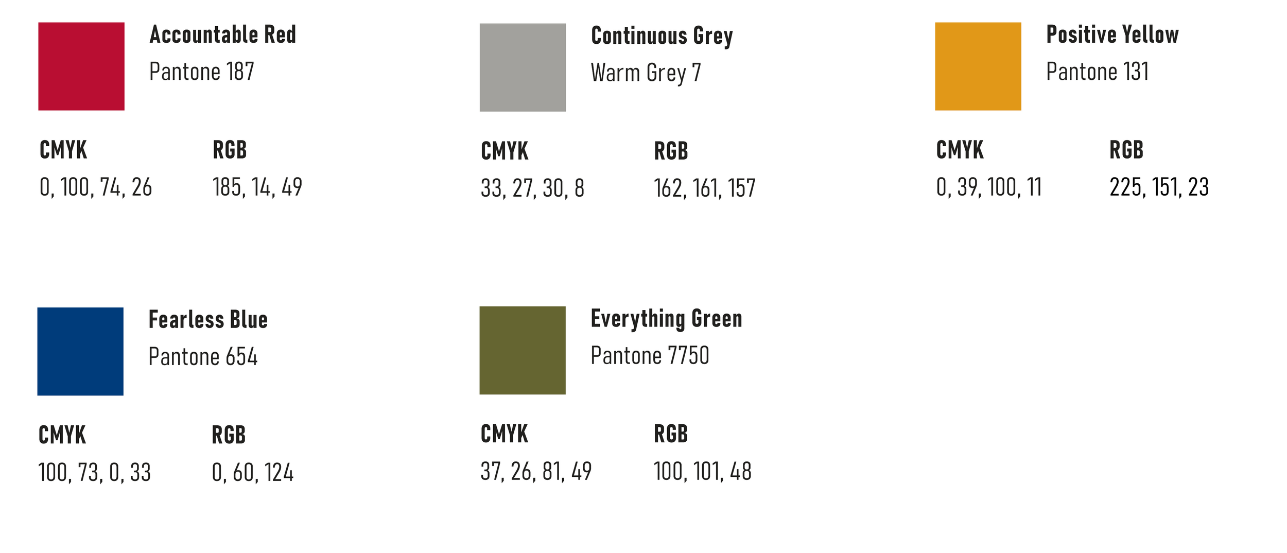
BAHNSCHRIFT semi-condensed bold, all uppercase, size can vary, colour should be grey, black, red or white
Style 2 –Body copy
BAHNSCHRIFT semi-condensed, 11pt, grey
Body
Please use Arial 10pt, black for the body text of your emails. Don’t add background images to the body of your email.
Signature
When creating your email signature, please use the signature below as a guideline. The first section is Arial 10pt and the second section is Arial 8pt.
Please don’t add extra comments or quotes after your email signature unless provided to you by DyTerra.


